06
Crooked Lane Books
Client: Crooked Lane Books
Client: Crooked Lane Books
Overview
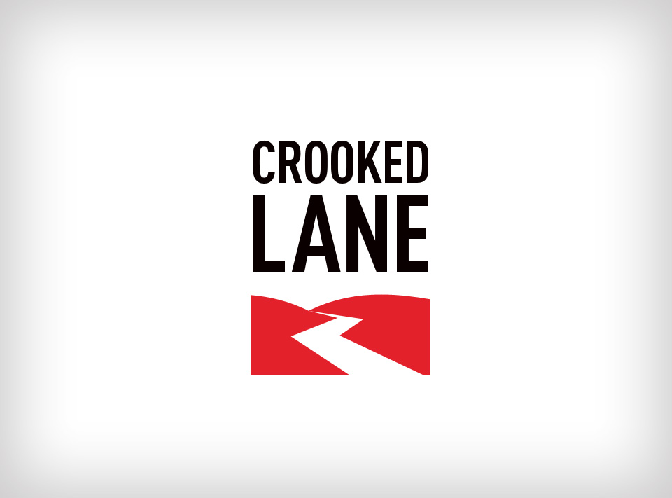
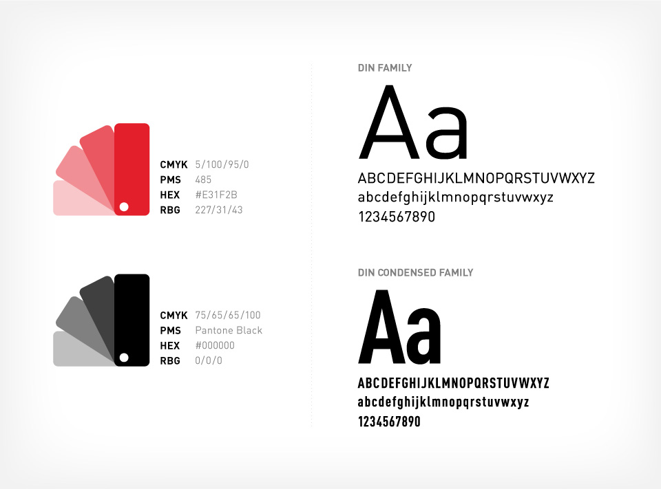
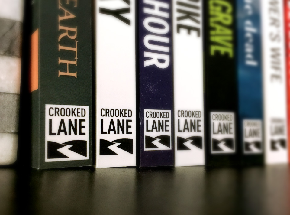
Crooked Lane Books is a crime fiction imprint that publishes today’s most gripping mysteries, thrillers, and suspense novels. It was a priority for the logomark to be simple and clean. It needed to be simple because the logo needed to be legible at very small sizes. The usage of red and black, often associated with mystery novels, were used to symbolize blood & darkness. Also, red is very striking, making it stand out.
Crooked Lane Books is a crime fiction imprint that publishes today’s most gripping mysteries, thrillers, and suspense novels. It was a priority for the logomark to be simple and clean. It needed to be simple because the logo needed to be legible at very small sizes. The usage of red and black, often associated with mystery novels, were used to symbolize blood & darkness. Also, red is very striking, making it stand out.
- Key roles
 Branding
 Logo Design
 Stationery Design
 Creative Direction
 Email Design
 Graphic Design
 Social Media
“

—Matt Martz, Editorial Director, Crooked Lane Books
”
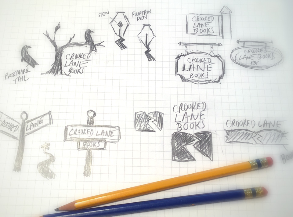
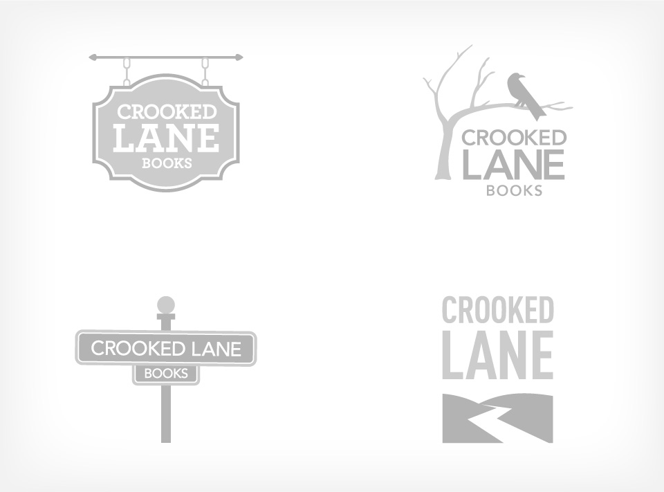
Logo development
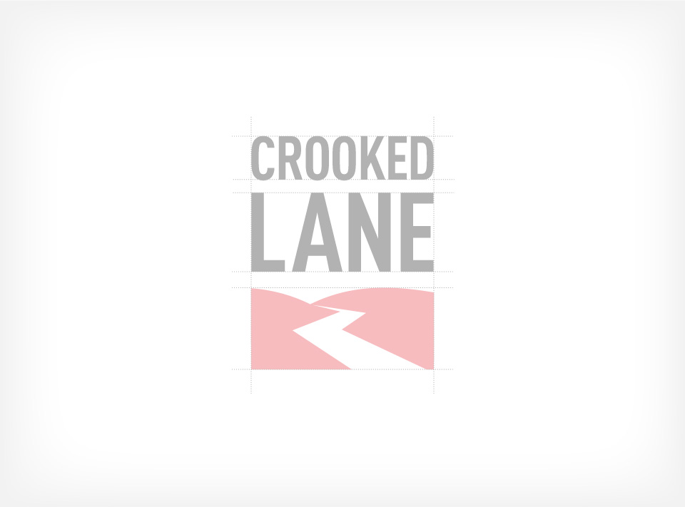
Branding color palette & typography
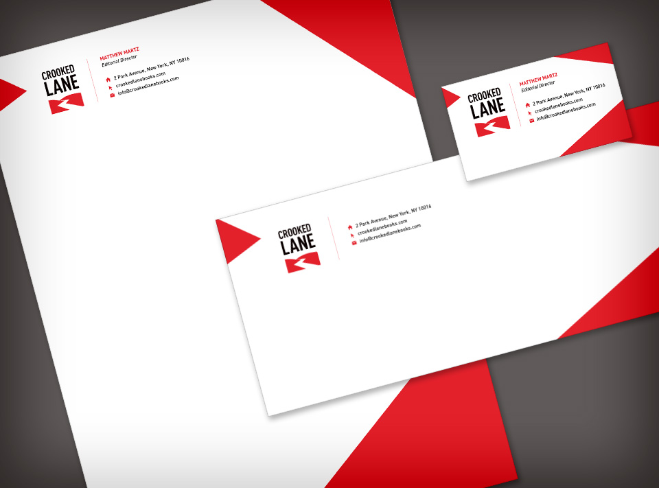
Corporate stationery
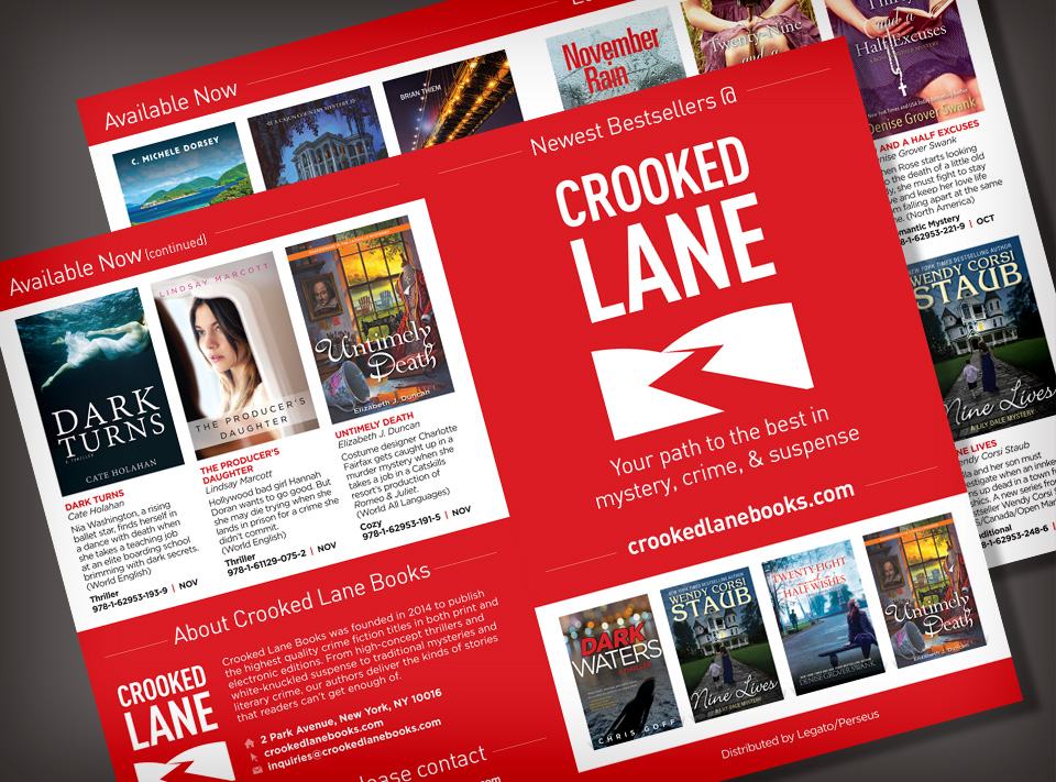
Catalog
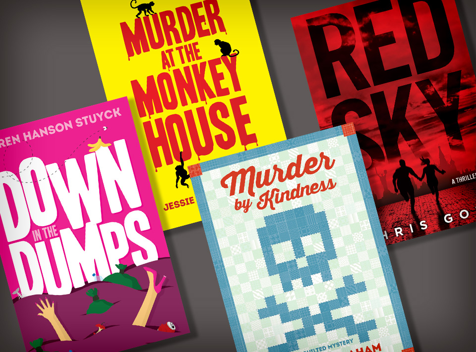
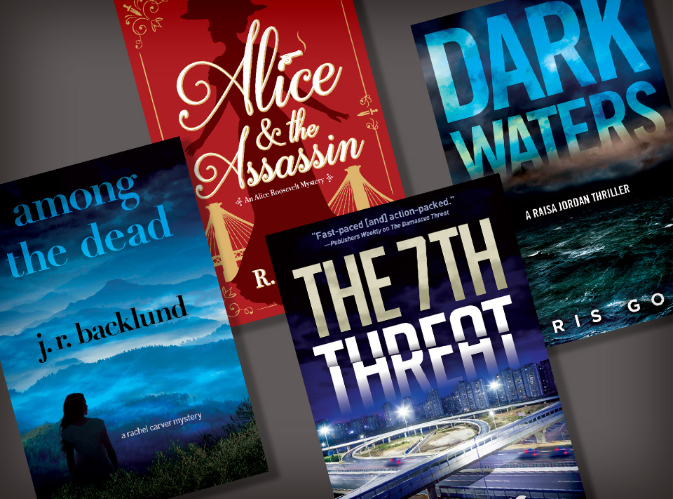
Book covers
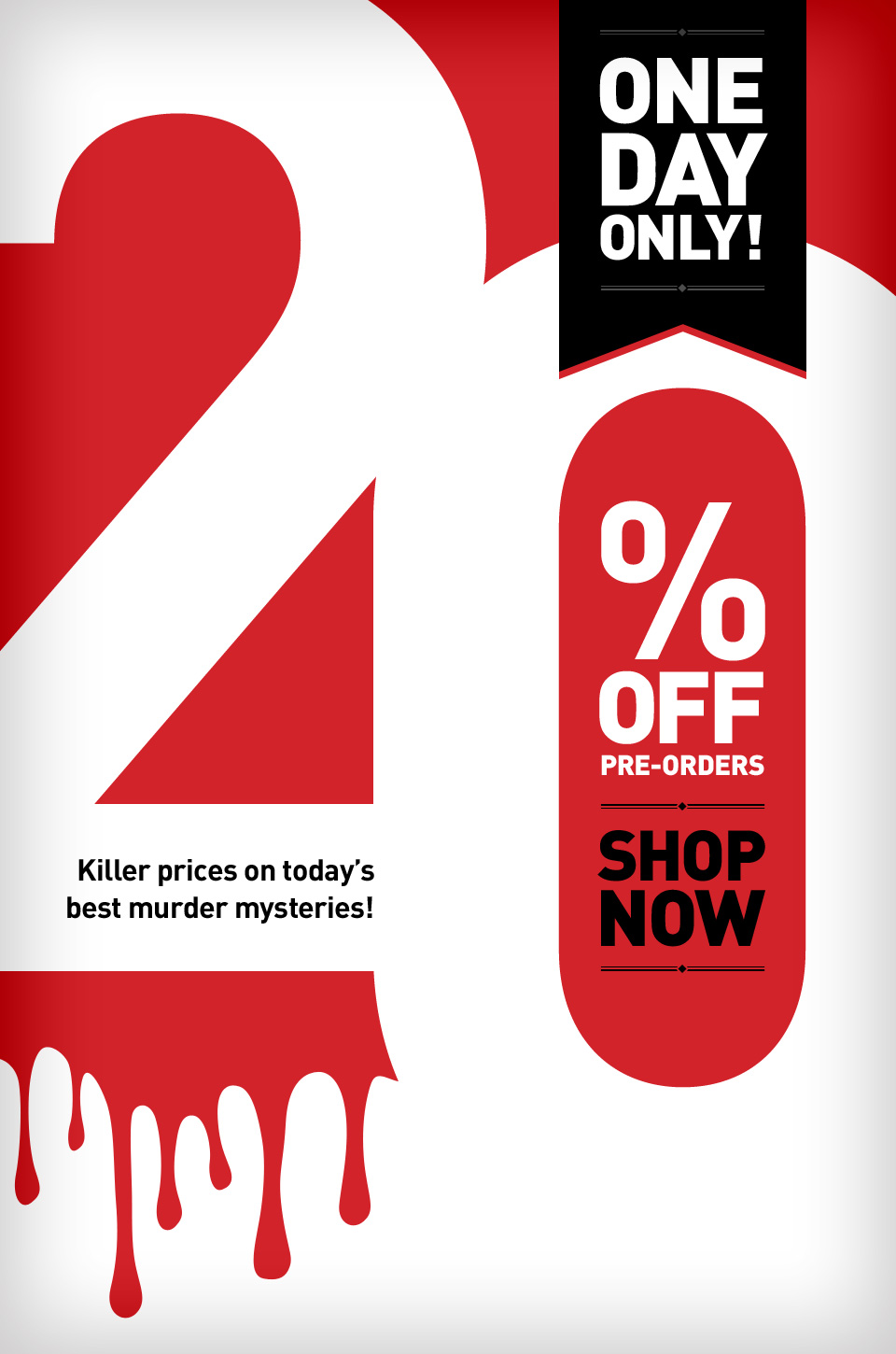
Email promotions


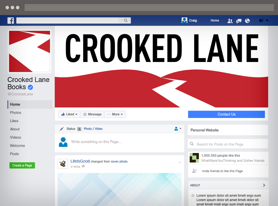
Social media page

 Hire Me Now
  Email
Email  917.836.5404
  Resumé
  Connect